What colours should I use to paint landscape paintings?
- Annabelle Lee
- Dec 12, 2025
- 4 min read

Updated: Dec 13, 2025
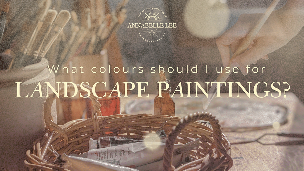
This is a question that I asked myself as a beginner artist. Now, with hundreds of paintings under my belt, I think I've found the answer (or at least, an answer) to this question.
When it comes to building a colour palette for oil painting—especially landscape painting—I like to keep things simple, intentional, and practical. One approach I’ve stuck with for years is having a warm and cool version of each colour on my palette. Every colour has a point where it travels up the spectrum (becoming warmer) or down the spectrum (becoming cooler), and having both options gives me the flexibility I need in my mixes.
Below is a full walkthrough of every colour on my oil painting palette right now, how I use each one, and why they matter in my work. This is the same palette I use for eucalyptus trees, Australian landscapes, distant hills, and all of the atmospheric effects I love painting.
Why I Use Warm and Cool Versions of Each Colour
Even warm colours have both warm and cool variations.For example:
Cool red: more pink or magenta
Warm red: more orange or burnt red
Keeping both on my palette helps me shift colours in the direction I need—cooling them without dulling them, or warming them without pushing them too far.
Titanium White: My Everyday Essential
I always use titanium white because of its opacity and predictability.I’ve tried other whites—zinc white, flake white (which is lead-based), and others—but titanium white gives me consistent results. I use white in almost all of my mixes, so reliability really matters here.
Lilac & Pale Lavender: The Colours I Can’t Live Without
One colour that surprises people is lilac or pale lavender. I’ve had this colour on my palette for years. I use:
Lilac (Art Spectrum)
Pale Lavender (Meden)
I use these to:
Lighten colours without washing them out like white does
Tone down yellows in the distance
Support aerial perspective (yellow disappears first with distance, then red, leaving blue)
These soft violets are essential for keeping distant colours gentle and atmospheric.
Titanium Yellow: My Warm Lightener
Another favourite is titanium yellow (Art Spectrum). It works similarly to the lilac, but on the warm side. It lets me lighten colours without chalkiness, and it’s perfect for distant yellow fields or canola far off on the horizon.
Together, lilac (cool) and titanium yellow (warm) give me two gentle ways to adjust colour without overusing white.
Poppy Red (Warm Red)
A newer addition is Poppy Red (Schmincke), which is technically a PO pigment (an orange), not a red. It’s incredibly warm and vibrant.
I use it for:
Sun-hit gum tree bark
Warm highlights in golden hour
Mixing bright oranges without tipping into pink
It’s the warm counterpart to my cool red.
Crimson (Cool Red)
Crimson is my cool red and is vital for my shadow mixes. I don’t use black on my palette—so I create a chromatic black using:
Crimson
Ultramarine blue
Burnt umber
Crimson also helps neutralise greens, especially in tree foliage. Australian gum tree shadows often shift into a muted, cool, almost purple-green, and crimson is key for achieving that.
Ultramarine Blue & Cerulean Blue
These are my two essential blues:
Ultramarine Blue
Pushes mountains and hills into the distance
Cools down the upper parts of the sky
Creates atmospheric depth
Cerulean Blue
Helps bring areas closer to the viewer
Useful for skies near the horizon
Often ends up in my foreground green mixes
They work beautifully together for atmospheric perspective.
Burnt Umber: The Workhorse of My Palette
A good burnt umber is dark, slightly transparent, and incredibly versatile. I use it in:
Highlights (to keep white from jumping too bright too fast)
Shadows
Greens
Neutrals
Along with yellow ochre, burnt umber is in almost every mix I use.
Raw Sienna
Raw sienna is more orange and darker than yellow ochre. I use it for:
Sunlit eucalyptus foliage
Winter foliage that leans red
Warm, earthy yellows that aren’t overpowering
It keeps yellows grounded and natural.
Burnt Sienna
Burnt sienna is darker, redder, and one of my go-to colours for:
Midground grasses
Midground tree foliage
Shadows
Cloud mixes (burnt sienna + white for soft warm clouds)
It subtly knocks yellow out while keeping the warmth in green mixes.
Lemon Yellow (Used Sparingly)
I use lemon yellow very sparingly. It usually appears in:
Foreground grasses
Select midground highlights
Small areas where sunlight really pops
It’s potent, so a little goes a long way.
Yellow Ochre: Another Core Workhorse
Yellow ochre is in almost everything I paint. I use it to:
Tone my canvases
Adjust skies
Warm up rocks
Build greens
Control saturation
It keeps everything earthy and cohesive.
Sap Green: A Useful Convenience Colour
There’s mixed advice online about using greens straight from the tube, and I understand why—greens are notoriously difficult to paint convincingly.
I added sap green to my palette mainly for plein air painting because it saves time. But I never use it alone.
I always mix it with:
Burnt sienna
Yellow ochre
Cerulean blue
Crimson
This keeps my greens varied and natural instead of flat and artificial.
My “Scrap Grey”: The Secret to Colour Harmony
At the end of each session, I mix all my leftover piles into a neutral scrap grey (or “mud”). This becomes:
My starting grey for the next painting
The base that ties colours together
A way to reduce waste
A tool for creating subtle continuity between paintings
Because I paint similar subjects with the same palette, this scrap grey adds an underlying harmony to everything I create.
Final Thoughts
This palette has evolved slowly over time, but most of these colours have stayed with me for years because they consistently help me achieve the atmosphere, softness, and realism I love in my landscapes.
I hope this deep dive into my colour palette was helpful, whether you’re building your own palette, experimenting with pigments, or just curious about how I create the tones in my work.
If you liked this blog, you will love this Youtube Video!
Comments